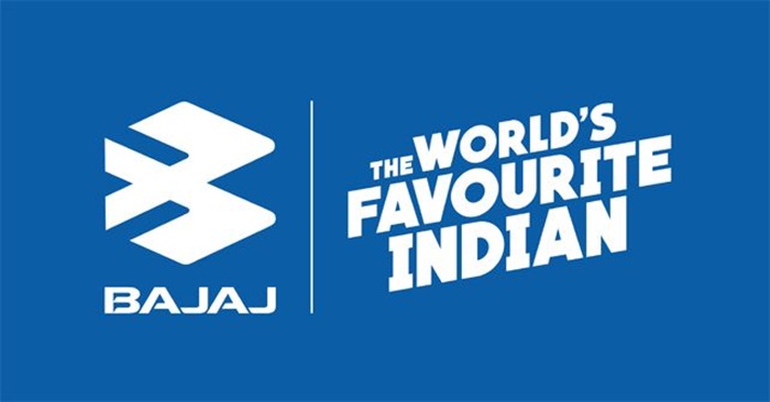
The very first moment you lay your eyes on a Bajaj bicycle, scooter, or auto rickshaw on the street, the initial thing that catches your attention is the logo. It’s stylish and striking. The logo has evolved into a symbol of reliability, heart, and Indian engineering. Bajaj has become a part of every Indian household for generations now, either in the form of two-wheelers, three-wheelers, or home appliances.
The Bajaj logo is not only a company logo. It is a tale of development, independence, and trustworthiness over time. Blue badges to silver symbols, the Bajaj logo has evolved but not literally.
What is Bajaj Symbol
The Bajaj symbol is the logo of Bajaj Auto Limited, a company which is an Indian automobile manufacturer. The company is a subsidiary of the bigger Bajaj Group, with holdings in finance, electronics, and energy.
The logo is featured on all the products of Bajaj such as:
• Motorcycles such as Pulsar, Dominar, and CT series
• Commercial vehicles and auto-rickshaws
• Electric scooters and concept bikes
• Advertisements, hoardings, and service centers
Bajaj’s logo is elegant, simple, and new, just like the idea of the company being innovative.
History of Bajaj Symbol
There has been a succession of transformations of the Bajaj symbol since the establishment of the company. Each alteration of the design is a milestone in the company’s history.
Timeline of Evolution of Bajaj Symbol:
- 1940s to 1970s: In the early years of Bajaj, the name of the company used to be written in bold simple letters. Simple, as during India’s initial post-independence period of industrialization.
- 1980s to 1990s: Bajaj Auto became fashionable with scooters Chetak and Super, and therefore the logo then began surfacing with a round badge or “BAJAJ” in capital letters on white.
- 2004: Launched the new “flying B” logo. The logo was two sleek wings holding up the letter “B,” symbolizing speed, freedom, and progressiveness. Blue symbolized trust and reliability.
- 2021 to Present: Bajaj redesigned its logo to a metallic silver logo with sharp angles and an aerodynamic shape. It is simpler but still has the same “B” shape.
Both logos symbolize India’s shift towards a digital and global era from the era of machines.
Meaning of Bajaj Symbol
The symbol of Bajaj is modest but significant in both the form and color used on it.
Symbol components and their meanings:
• Letter B: Symbolizes the name of the company Bajaj and stands for Boldness, Brilliance, and Bharat (India).
• Wings: Represent freedom, innovation, and progress. They represent the company vision of moving forward and allow citizens to “ride with pride.”
• Triangular shape: Geometric lines represent engineering class and strength.
• Blue color (past) and silver (current): Blue represents confidence and reliability, and silver includes contemporarity, class, and speed.
The Bajaj symbol as a whole represents a company that believes in movement, technology, and reliability.
Bajaj Logo Shape and Design
The Bajaj logo is designed in 3D geometric shape and the letter “B”. It is inclined, curved, and centered, with dynamic impact.
Key design factors:
• Dynamic composition of two blocks with stylized “B” shape
• Metallic appearance with reflection
• Usually followed by “BAJAJ” in bold capital letters at the back
• Proportional balance and linear lines to give it a modern look
The symbol represents movement and change. From a first glance, the wings appear to be in flight.
Bajaj Symbol Color and Meaning
Color is a key component of any brand. Years have witnessed Bajaj using blue and silver colors.
Symbolism of color:
• Blue: Represents trustworthiness, loyalty, and consumer trust. It assures that Bajaj is a reliable business.
• Silver or Metallic Grey: Conveys technology, advancement, and modernity. Globalizes and hi-tech-ifies the new Bajaj symbol.
• White background: Used most frequently in promotions to mean simplicity and chastity.
Combined Effect of Colors
The combined impact of the aforementioned colors makes the Bajaj logo sleek along with authority.
Bajaj Symbol in Products
Bajaj logo can be seen on almost all the goods and accessories which are being manufactured by the company currently.
Usage Examples:
• On Pulsar scooters and on Dominar fuel tank
• On scooter handle bar
• On three-wheeler front side
• On oil tin and spare part kits
• On television commercials and online campaign
The logo is typically embossed or printed in silver or chrome and therefore provides a premium and bold appearance.
The Symbol and Brand Values of Bajaj
Bajaj’s symbol is what embodies the company and its values. It is not a machine but something emotional regarding it.
Bajaj’s values through the symbol:
• Innovation: Continuously modifying its design and technology to fit into the current world.
• Reliability: Famed for products that are resilient and reliable enough for millions of people to rely on.
• Liberty: All Bajaj vehicles promise liberty of movement and independence.
• Indian pride: Bajaj shall always be and always was a symbol of “Make in India” and self-reliance.
The customers are immediately associated with a brand that combines Indian values and international quality the moment they glance at the Bajaj brand.
Bajaj Symbol and the Slogan “The World’s Favorite Indian”
The logo and the tagline “The World’s Favorite Indian” would complement each other. As they depict global popularity and Indianness in the stylized “B”.
The use of logos brings to mind the vision of Bajaj to showcase Indian engineering to the world. The message it conveys is that Bajaj is not an Indian company but a global brand name on which continents rely.
Symbol Use in Marketing and Advertisements
The Bajaj symbol is always placed at the center in ads. Power and reliability is what it spells at first sight.
Usage:
• TV and YouTube advertisements
• Billboard and poster advertising for Pulsar or Dominar bikes
• Service centers and retailing outlets
• Official accessories such as helmets and jackets
Since the symbol is iconic and simplistic, it looks good in any size and medium, whether print or digital.
Evolution and Modernization of Bajaj Symbol
Bajaj’s new symbol has been simplified in line with modern-day minimalist style. Business reimagined the shape to suit digital media and new electric vehicle brand identities.
Some of the existing design features are:
• Metallic gradient 3D simplicity
• Space-age-looking rounded corners
• Scalability for mobileness, website, and digital instrument panel
The move mirrors Bajaj’s transformation as a technology-enabled mobility player from its heritage as a domestic carmaker with worldwide aspirations.
Bajaj Symbol and Other Bajaj Group Companies
Though the Bajaj symbol is typically owned by Bajaj Auto, the other Bajaj Group companies follow the same brand heritage for continuity.
Examples:
• Bajaj Finserv: Slim logo with a very similar geometric shape.
• Bajaj Electricals: Same “Bajaj” font with modern variations.
• Bajaj Allianz: Using the Bajaj brand name with the insurance partner’s logo.
This universal design system renders the brand easily recognizable regardless of the industry.
Bajaj Symbol in the Global Market
The Bajaj symbol is not only popular in India but also used in over 70 nations. It adorns exports to Asia, Africa, and Latin America.
It uses a simple and global design language. Silver “B” is used trans-culturally as it symbolizes movement, power, and dominance which are acceptable anywhere.
Fascinating Facts regarding the Bajaj Logo
- “Flying B” shape was first introduced with the Pulsar series as a representation of speed.
• Bajaj Auto was one of the early Indian companies that came up with a logo representing the modern movement.
• Geometric lines were chosen to be used by the designers since they represent actual engineering.
• The Bajaj logo is more familiar to most Indian families than any other auto logo.
Bajaj Symbol Meaning to Customers
Indian riders and consumers consider the Bajaj logo meaningful. It is linked with:
• First bike or scooter one ever purchased
• Memories of travel and road trip adventures
• Middle-class symbol of success and accomplishment
• Indian enterprise standing up to multinationals
The Bajaj logo is not just put on wheels, it’s in memory, history, and everyday life.
Summary of Bajaj Symbol
| Feature | Description | Means |
| Shape | FLOURISHED “B” with wings | Speed and progress |
| Colour | Blue (ripe), Silver (fresh) | Trust and technology |
| Design | 3D geometric shape | Innovation and technology |
| Symbolizes | Bajaj Auto brand | Trust and independence |
| Slogan | “WORLD’S FAVOURITE INDIAN” | Global achievement and Indian pride |
The Bajaj logo is not just a company logo. It is the seal of trust, innovation, and Indian excellence. From superbikes to scooters, Bajaj has carried this seal generation after generation, reminding one and all of the nostalgia of freedom, power, and pride.
The austerity of the “B” model belies deep meaning, progress at no compromise in identity. As a Bajaj car comes tearing down the highway, its shiny logo tells a story of hope and achievement begun in India but bound for the world.


